BPI Printing Services Contact
BPI Printing Services

Posts by

express

What is your dealership doing to stand out from the crowd?…and it really is a crowded competitive market. As consumers decide on the car they want on-line; the next obvious decision is “Who am I going to buy from?’ This is where differentiation plays a vital role in clarifying what makes you the right choice. You can’t always categorize your demographic into male, female, 35-54, affluent, family, youth…the list goes on. You have to be all things to all people and if you can’t figure that out, you can be sure your competitors will be trying.

At the Big Picture Imaging Inc. www.gobpi.ca, in association with the Dealership Design Group, we start with the fundamentals. We want to get down to the core of what you, at the dealer principal level,  consider your approach to attracting and more importantly maintaining your customer base. We have heard the “We treat you like family” line so often now most people automatically filter that out as white noise. It’s time to get creative. Here are a couple of important things that could be your claim to fame.

 History

You opened your first dealership in 1971. Do you know that is 44 years in business. Do not underestimate the value that presents to a customer about to part with a big chunk of their personal monthly revenue. If you got it flaunt it. We can help deliver images that reinforce the equity in that history.

 Community Activism

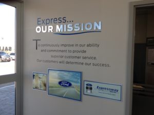
It’s harder to really play this card if you are one of many dealers in an urban area, but if you are the only dealer carrying a brand in a smaller town. This is important. It has to be real too. If you are going to shout from your rooftop that you care about your community; be genuine and receive the benefits that are incremental to the benefits of supporting your community. One dealer we know keeps track of the percentage of people who use their boardroom for community meetings, that come back as customers. It’s a double digit percentage. A graphic illustration on one of the walls in there that shows dealer involvement in the community speaks quite clearly about what matters to you, is them.

 Best value for the dollar; not cheapest

At the very beginning of the relationship stress value. Low price does not usually equate to best value. How do you give them MORE for their money. Is it professionals who give them a reason to buy, versus selling them the left over ice that the Eskimo didn’t need? The message of value is an important message to promote, but it has to be real. If everyone on staff doesn’t buy into the program, customers can spot a fake a kilometer away.

 Fair Dealings

A great way to do this is by having a testimonial wall. A percentage of your customers are what are called by Malcolm Gladwell, Marketing Mavens. If they are thrilled with your service they will tell the world for you. Recognize these people. Get a testimonial from them and place it on a wall that potential customers can’t help but notice. Are you taking potential customers on a tour of your facility? You should be and you should have a planned tour that reinforces why they will prefer coming back to you instead of that place where they can’t help but wonder if someone is taking advantage of their lack of knowledge.

 Customer-centric

Do your hours reflect what’s best for your customers or what is best from an operational standpoint? Do you offer shuttle services that make it easy for their vehicle to be serviced without them having to grit their teeth in agony while waiting…and waiting, Do you offer space where people can get work done while waiting. Do you use greeters to ensure every customer is acknowledged and accorded respect for them having chosen your building to have their automotive needs fulfilled.

If this is you; how can you communicate these issues so they can become a part of the equity in the brand that is YOUR dealership? We do it with the right communication images to reinforce the reality of what you offer. Not platitudes. Turn a blank wall into a communication medium to clearly let your customersAND reminds your staff every day, that the customer really is your priority. Not necessarily their wallets. Convince the customer that they really are the important issue and their wallets have a habit of being somewhere nearby.

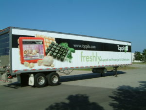
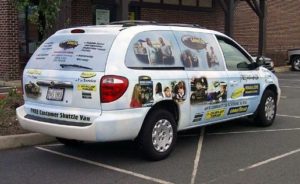
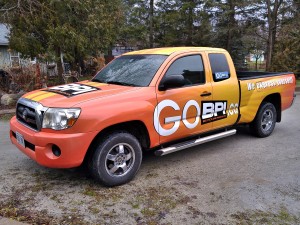
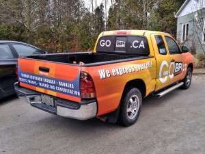
OK, so you are sold on the value of using a vehicle wrap to promote your business. You recognize it as the most cost effective way to generate impressions at the lowest possible cost per impression, when comparing to virtually any other form of media. Now comes the tough part. Creating a design that actually communicates information that will lead to a potential customer contacting you, placing an order and paying you so you can make a bank deposit.

53 Forward

Before I get into this, think about what you remember when you are purposefully investigating the landscape to see what other people are doing. Drive along the highway where the volume numbers get generated. Drive past a rolling wrap and see what you remember from the drive by, 5 seconds after you passed it. Odds are you may response with, “well…it was blue…and there was a website on it…and I remember that the driver should have got out of the left lane, because he was obstructing ME!.This example illustrates a lot of what NOT to do. Try to imagine seeing this in real life and if you would even bother trying to decipher what they are trying to tell you.

Now, let’s consider how to make that a high value, outdoor advertising mechanism that is actually effective. A vehicle graphic is more effective if it accomplishes 3 three things.

  • Eye candy that attracts attention
  • Any immediate (and I mean IMMEDIATE) understanding of why the viewer should care. Think about what your target needs to know.
  • An easy way to understand how to get more info

Miss Honda

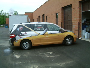
Eye candy is easy. We see white trucks, black and grey cars which seem to be the dominate the highways and bi-ways. A red, orange or yellow car stands out. There are a lot of colours, Some very standard that are unusual enough in today’s environment, that you will have many alternatives to pick from. Keep the colour background to a simple single colour, without complicating with a rainbow of colours because that is what will be remembered, not the benefit you want to express. A single bright (and clean) colour will accomplish step one “Look at me!!

You have now earned the right to tell them something. But be lightning quick. The more letters you apply to your vehicle, the more likely the response of a viewer will be  “Forget it. I’m never going to get all that, so I’m not going to start reading”. Think about how you filter out distractions as you are driving around. Letters mean a commercial truck. You have the radio on. Your are trying to halfway de-stress on your drive home from work. Last thing you want is some electrician telling you who he is when you have no need for one at the moment. The thing is, you may need an electrician in the future and if they gave you a reason to remember them, you could file it away for future reference. Same goes for all the trades. Any images that are a bigger detail of something that is usually small can make a huge impression, literally. If you saw a van driving by with a 4′ tall wall receptacle, what would you think? That guys an electrician. You don’t have to read it. You know it. Time lapse to having your attention and knowing what this vehicle is about is a second. You know have 2 seconds of a viewers attention left now to combine why they should care, with how to get more information.

You’re thinking, “oh yeah genius; website right?” Yes, website, but how you display your website can be a double whammy with one way more effective than another and one way being pretty close to useless. One way is illustrated below as a call to action, but there are ways to make that call based on the benefit you deliver. Don’t underestimate the value of a tag line. That tag line needs to do two things. Clearly identify what you do and clearly express why you are a good choice

C360_2015-12-21-15-28-33-943C360_2015-12-21-15-28-50-643


Got questions?

brian@gobpi.ca

Thanks for reading!

Brian

When you first read that question, your first glance might precipitate a reaction of “Huh?”, but let’s start by considering what both environments have in common.

Both are places where people want to be educated towards making buying decisions. Another very important component of both is that it is where people come together to find people who can answer questions. Establishing productive relationships between people is the absolute fundamental function of both environments. Once this is clearly understood, the objective of establishing functional environments that facilitate those relationships should be what drives the tactical executions that support a communications strategy.

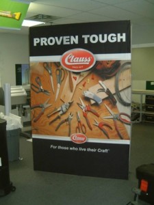
An effective trade show booth should stop a visitor first, so anyone manning the booth can establish a relationship with a capacity to support. An effective automotive dealership environment should do the same thing.

clauss

With the paradigm shift of consumers doing most of their automotive research on-line; the value of the environment they ultimately choose to do business becomes much more important. They already know what they want. They need to now choose and establish a personal relationship with a consultant they can trust. The graphic enhancements within the dealership support that critical issue. Bombarding a customer with sell, sell, sell is not conducive to making them want to buy, buy, buy.

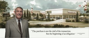
charleglen

Communicating the “value added” that a dealership offers is that point of differentiation that allows for why they should choose your dealership over a competitor, both alternative brands and same. Understanding what your fundamental principles are and illustrating them clearly, while not stealing the thunder of the product is a balancing act, that when successfully executed, puts the emphasis of allowing the personal relationship to grow.

This applies to any retail environment. Use interior signage with a softer approach of communicating lifestyle benefits your customers can relate to, so the ground troops have a more receptive audience who are open to reasons to buy. That’s what closes deals in a trade show booth, or on the showroom floor of an automotive dealership.

Who is BPI? Big Picture Imaging is led by  Brian Spiteri  www.gobpi.ca . Brian’s background in consumer packaging marketing, combined with action oriented sales management, drives ideas associated with finding that balance of motivating action with an effective aesthetic. BPI converts ideas into the concrete applications including production and installation. Contact me at: brian@gobpi.ca  BPI is also a partner in the Dealership Design Group where we partner with JMPort Design in creating effective automotive environments Dealership Design Group

express

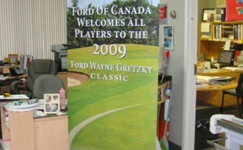
Ford banner Stand

This is one of those categories where price versus value are important considerations.

In the last few years, there has been an influx of inexpensive banner stands. There are a couple of key areas where manufacturers save costs to meet the demand for a low price product. First is the grade and thickness of the material used to make them. Thinner and thinner aluminum is not about making the stands lighter weight and easier to transport . It’s about making them at lower cost. There is no question that there is a demand for lower cost products.

But there is a trade off. Thin means easily damaged and anyone who utilizes these stands knows the abuse they can take. The main issue is the spring mechanism. Very few of the cheaper products can handle the repeat requirement of pulling them up, under tension, and retraction back into the base.

another area of cost is the material used for the graphic. The cheaper media will retain the memory of being curled up tight in the base. Better quality medias are designed to forget the curl and lay flat when extended.

It can come down to this. You can never make a second first impression. If a potential client sees a sloppy presentation of your brand; what are their concerns about how to actually execute your services? Do you want to be concerned about that?

Check us out at Retractable Banner Stands at gobpi.ca

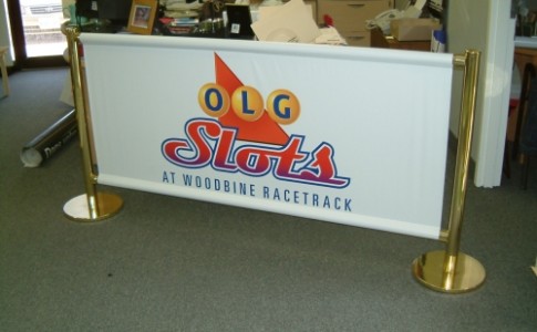
Banners are a very simple device to express information to an anticipated audience. A banner can be used to welcome, direct or inform and while people spend a lot of time designing them; it is equally important to understand how you are ultimately going to display them.

We do all kinds of banners. From the basic banner that you stretch between two trees to the banner that hangs from a ceiling, or displayed on a parking lot post, displayed at a trade show, zipped tied to a chain link fence,mounted to a floor stand and, and, and…Although we are very adept at designing banners that communicate the information required effectively, we also are a good source of information on how to display them.

One very important issue associated with banners is how long they will be used. Are they going up for a single event with a very specific communication function (Welcome to the wedding) or will they be used for a more prolonged period (a designated parking area)? A very important issue to consider is movement. The less movement your banner experiences; the longer it will last. One of the fastest ways to shorten the life of a banner is to cut “smiles” into them. Those smiles, that are suggested as a way to allow for air flow through the banner, actually destroy the integrity of the nylon scrim that is used to strengthen the banner and contributes to its destruction because the flapping leads to tearing.

banners-062

Banner finishing is also important. Short term; no hemming required. Longer term; a double stitch hem will prevent fraying. Even longer term, nylon webbing (referred to as seat belt within the industry) adds additional strength which can make for a very long lasting banner. Another issue related to banner finishing is the memory within the media used that can cause edges to curl. That curl can give a potential client a bad first impression of your business. With the challenge of finding customers; do you want to plant a seed of poor quality by the way to introduce yourself? You can never make a second first impression.

banners-056

Retractable banner stands allow you to safely transport and store your vertical banners and if your provider prints it on the right material, those edges won’t curl. Quality medias have been developed with that single express purpose. Other issues like how the media interacts with the inks to hold it and reproduce colours are another issue that your vendor, if they know what they are doing, will result in a quality banner that will last and more importantly, communicate a clear message without a distraction of a poorly produced or displayed image.

IMG_0899

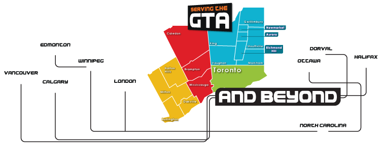
Flex Face systems have become the medium of choice for many large signs and we have, over time, found many systems to effectively determined which one is right for the variety of banner applications that we face regularly. The only constant is the variety of challenges encountered. There are so many circumstances to consider as we determine the most cost effective way to give your banner every opportunity to communicate your message. Contact me (Brian the Banner Guy) at www.gobpi.ca for help in the Greater Toronto Area from Kitchener-Waterloo in the West to Scarborough and Markham in the East.

Prev123Next
BPI logo

Open Hours: Monday - Friday, 8.00am - 6.00pm

Email: brian@gobpi.ca