BPI Printing Services Contact
BPI Printing Services

All posts in Mobile Marketing

A favourite client introduced me to this axiom. This was her response to my question, “Why do you use us as a resource when you know you could find cheaper alternatives?”

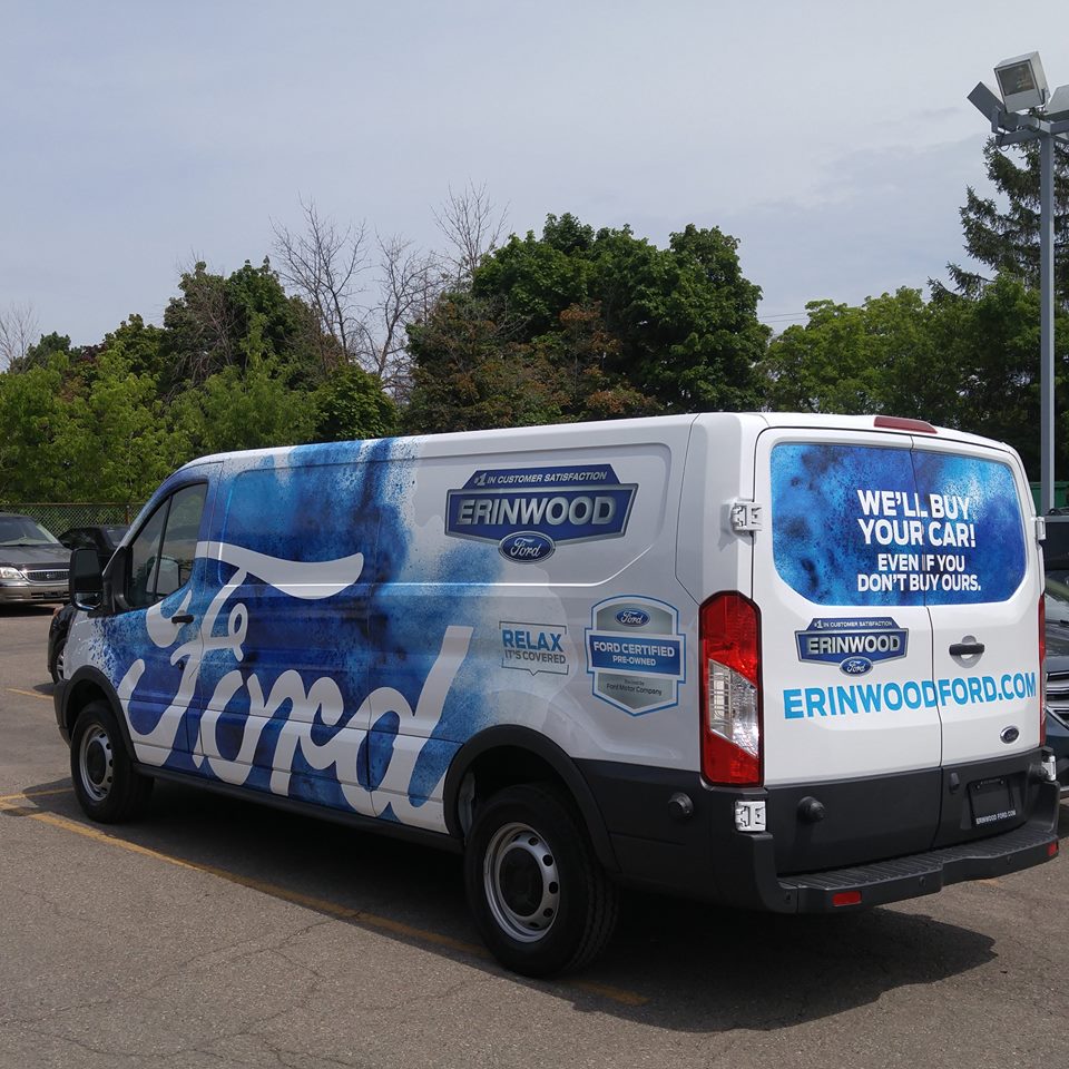
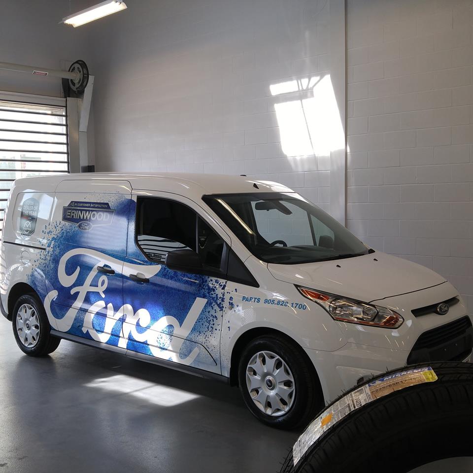
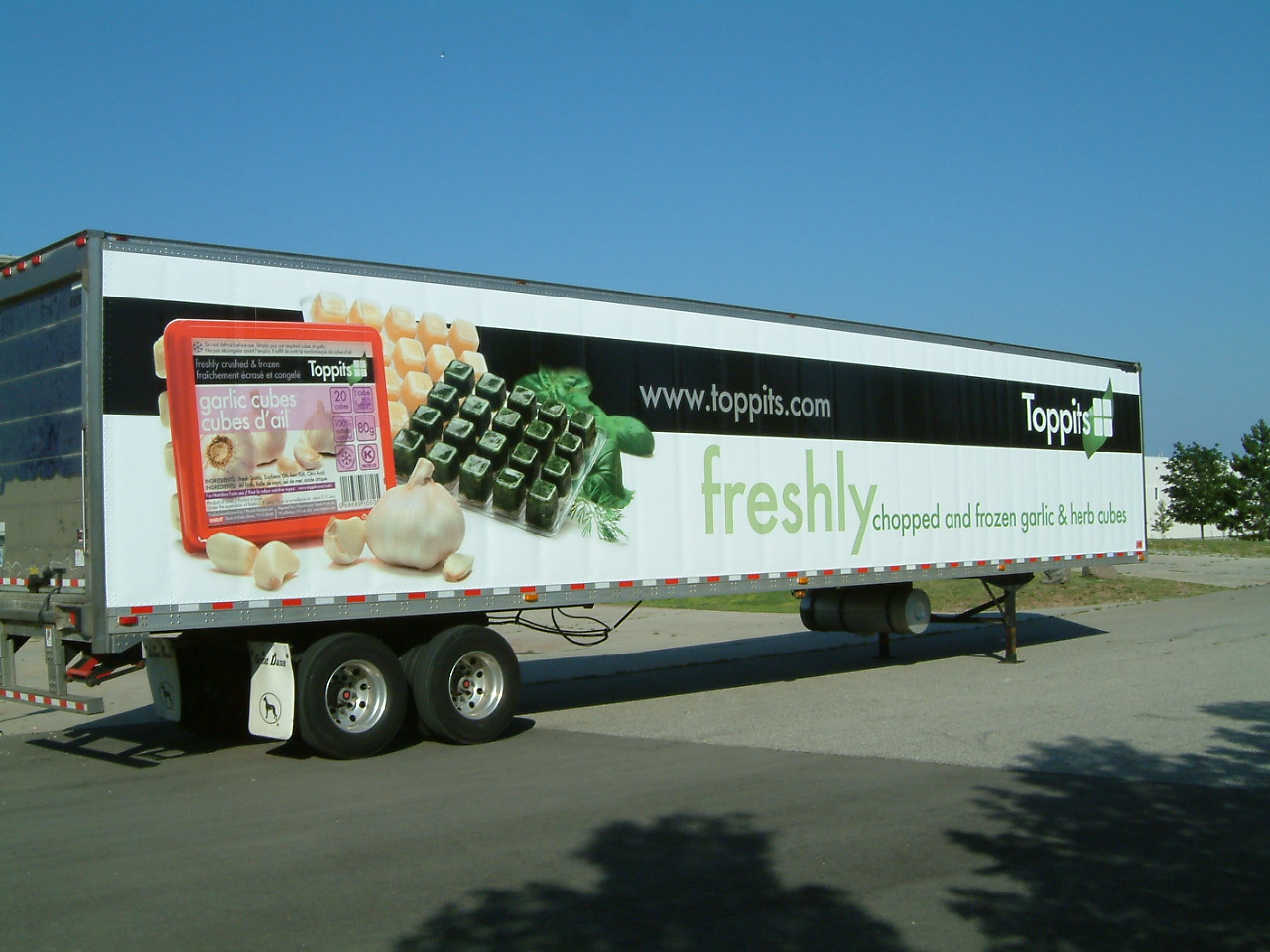
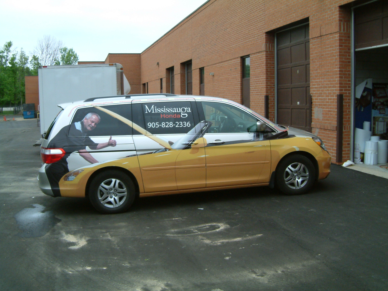
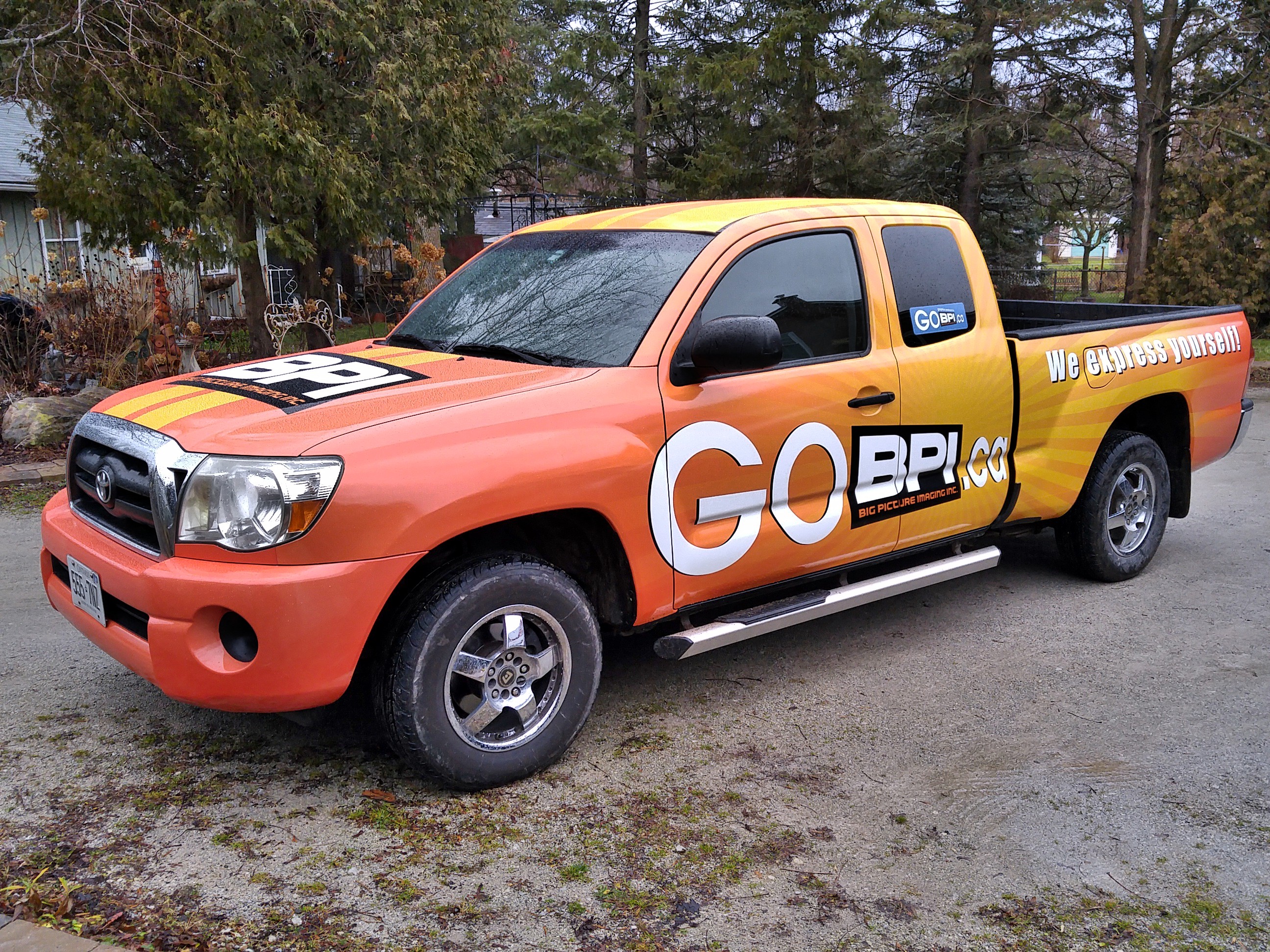
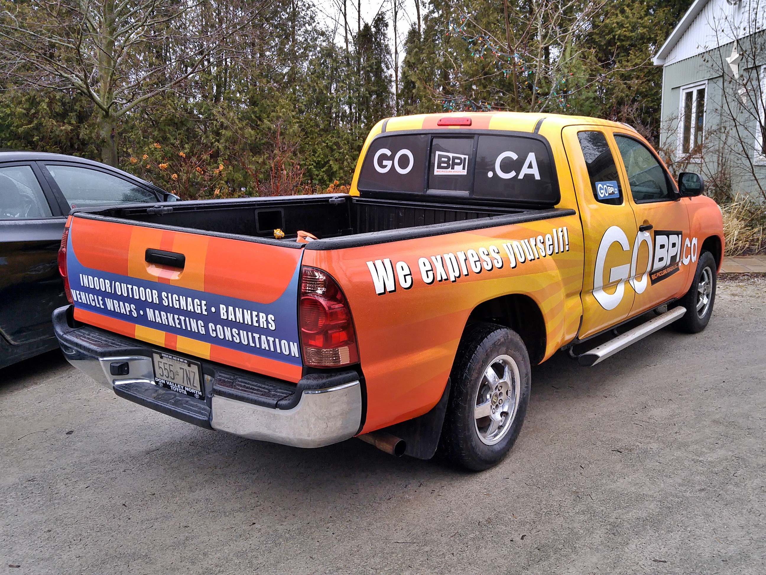
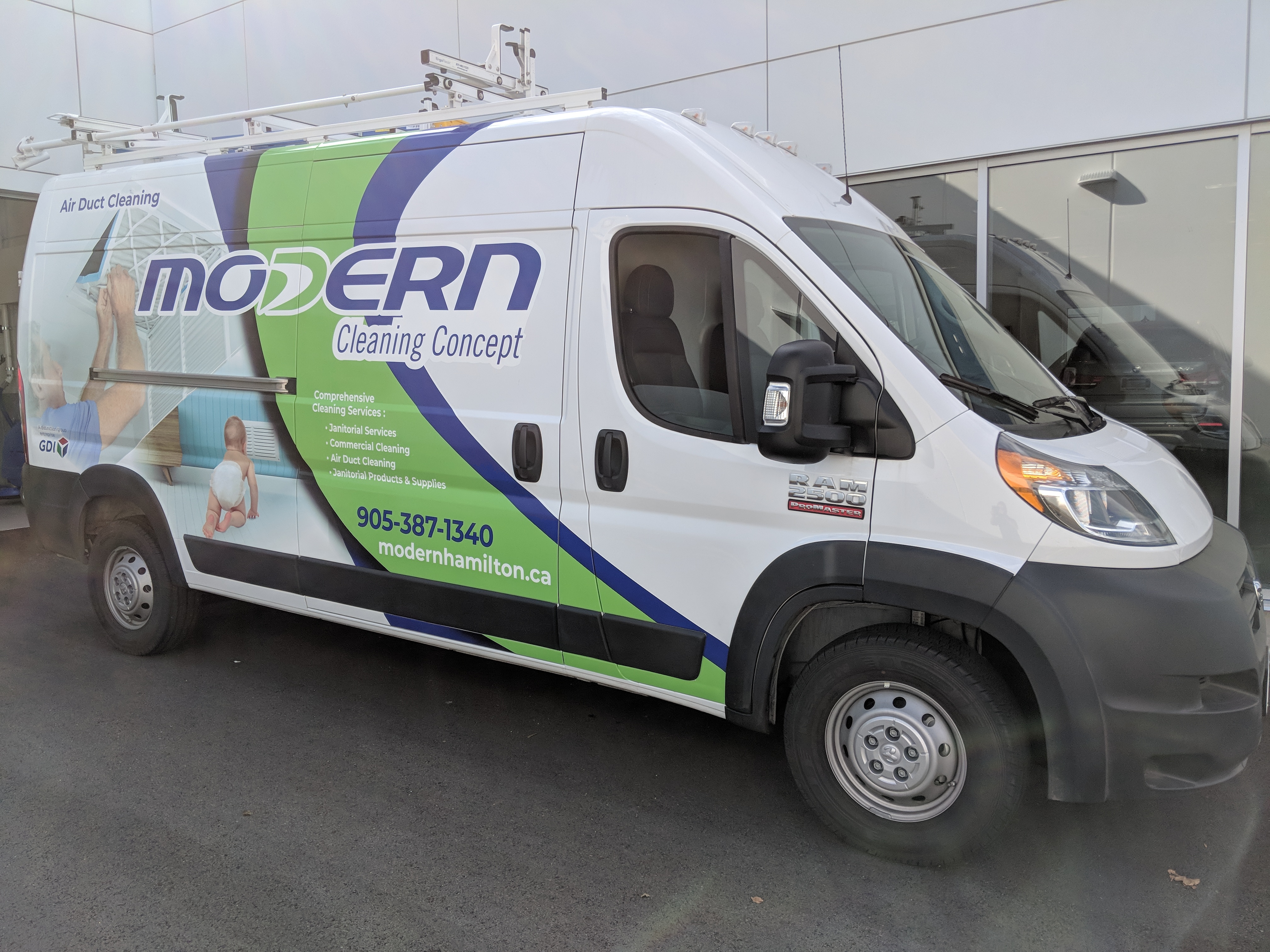
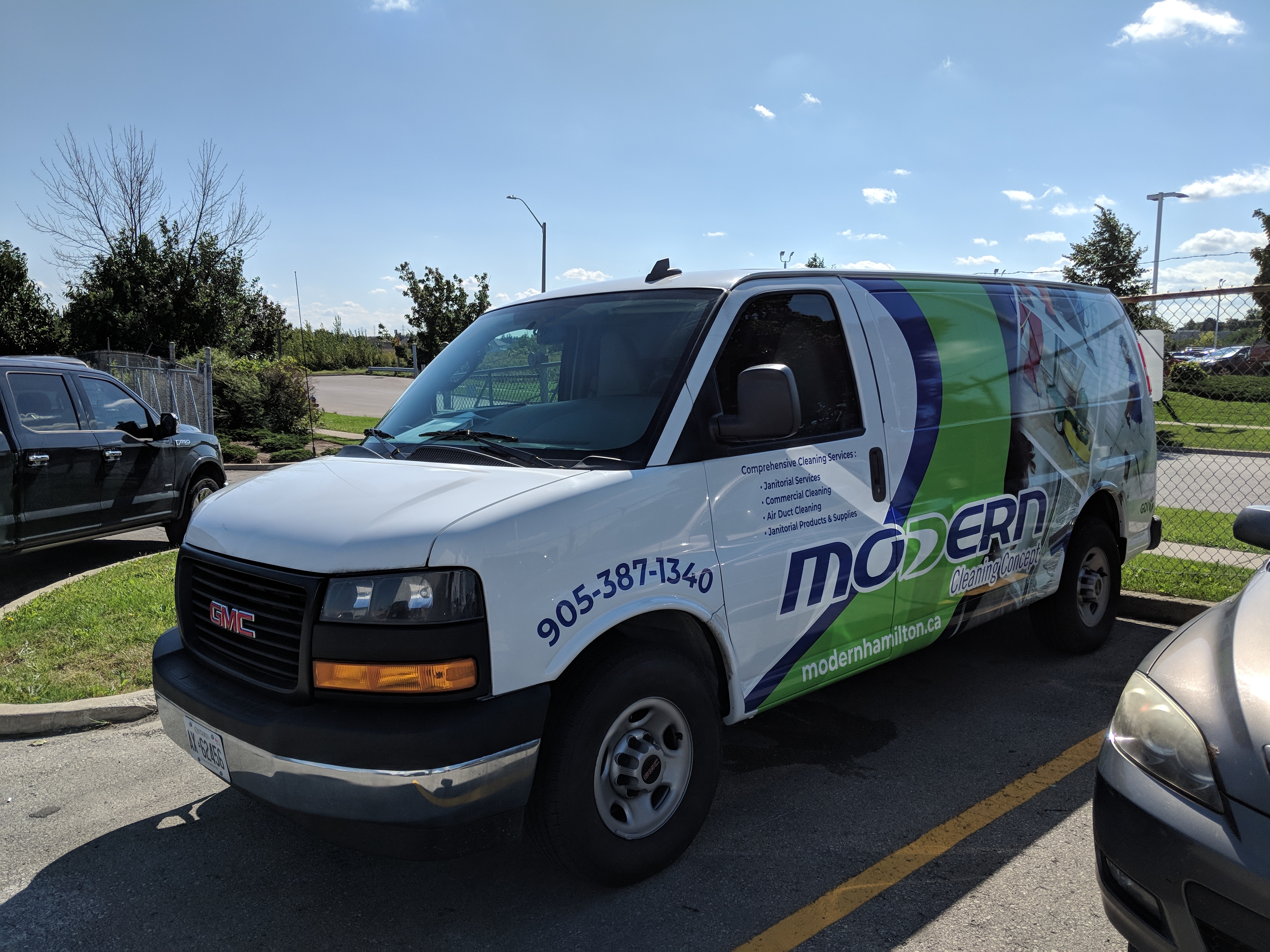
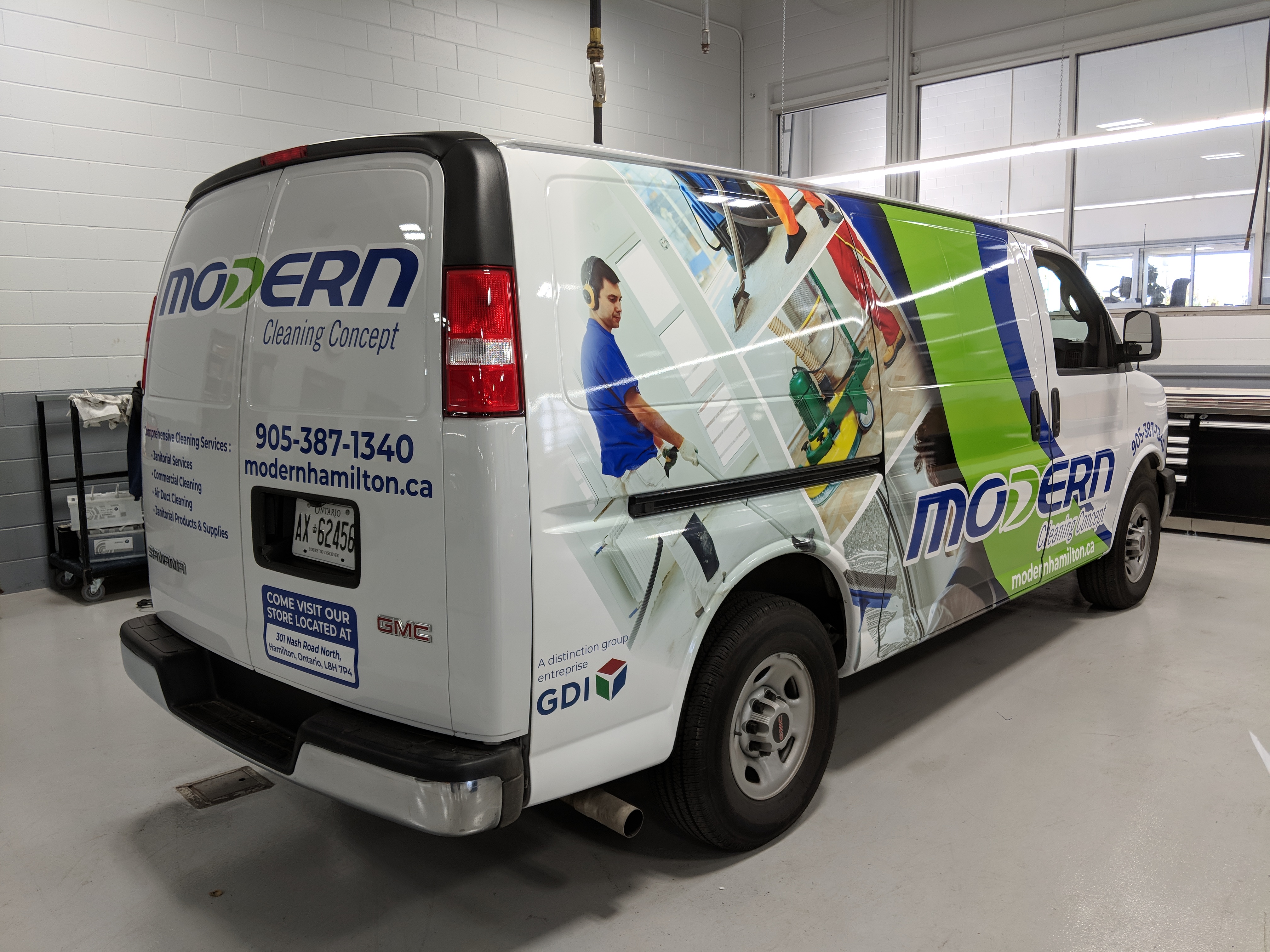
We have never been the cheapest game in town on vehicle graphics and we don’t based our prices on what our competition charges. We price our services based on what it is worth to put our focus, our experience and our effort to deliver a premium result in the hands of our clients.

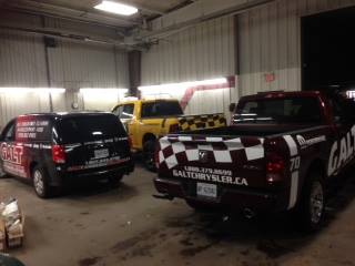
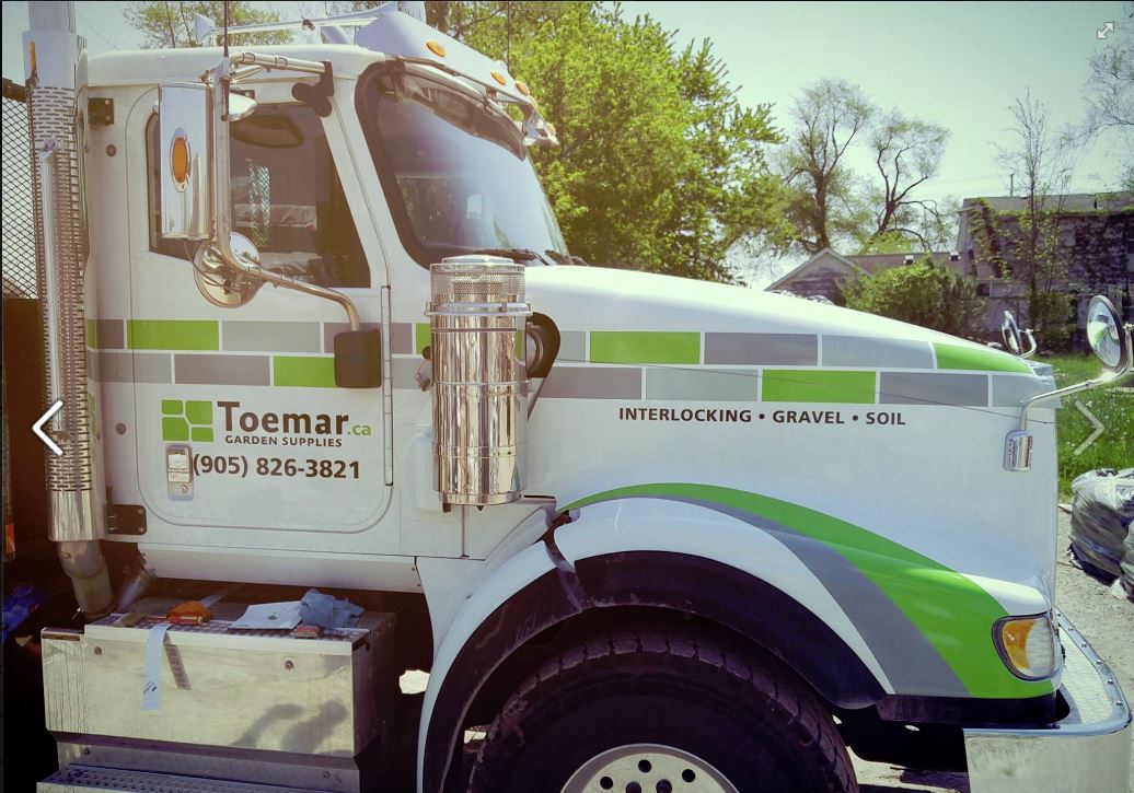
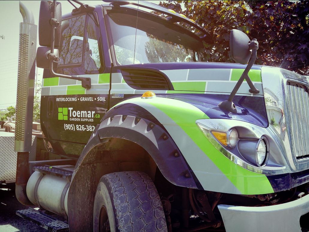
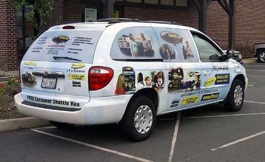
Case in point; we received a call from a potential client that wants us to fix a “botched” job on a vehicle wrap. This is not the first time this has happened to us. A client asks us to quote. We lose the bid because a competitor comes in cheaper and then they come back and want it redone properly. Our quote doesn’t change, but we have to add on a fee to remove the inadequate previous job. That is when cheap gets expensive.

It means something else too when you are driving your mobile marketing message. The impression that vehicle makes is exactly the impression that is displayed to suggest your company either cares about quality or it doesn’t. If you don’t care about the impression you make to your customers before they engage your services; how can you expect them to think you care about the impression you have left after the job is done? Are we perfect? Nope. We have made mistakes but our clients can be confident that we will fix it and we will learn to ensure we don’t make the same mistake twice.

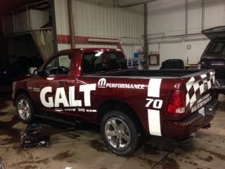
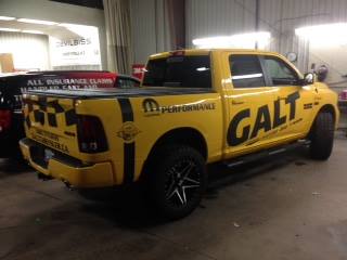
Anyone in this business knows what short cuts to take to save cost. How would you know if the inks used are UV resistant? How would you know that you can over-laminate vinyl with a film that will improve the UV resistance by a factor of five? Its not really up to you to know. It’s the responsibility of a value driven vendor to know that for you.

It all sounds like marketing mumbo jumbo, but the reality is that people want to confidently buy services. We all need to make resource decisions and we want to be assured we are making the right choice. We don’t knock on a lot of doors. Our sixteen years in the business brings us referrals based on satisfied clients being our best sales people.

So why am I telling you all this? To try to make you aware that value should be your primary driver; not cheapest price. Not just for vehicle graphics. For any purchase you make.

There it is. Short and sweet. Either that makes sense to you or it won’t.

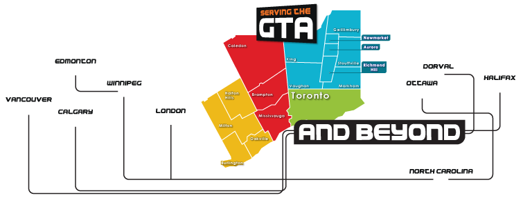
Got questions? Feel free to contact us if you are in the Greater Toronto Area. Preferably west end. I am not the biggest fan of the 401. Have a great day!  www.gobpi.ca

Doing it right the first time.

Please take note, This will be the only image provided on this blog and at the moment; this logo is meaningless to you. Please let me explain why.

Logos have taken on a fascinating relevance for many as a brand marker, but I wonder how many just use it for pure vanity. At this point in the blog that is all it accomplishes. Hopefully at the end, it might have relatively more. I hope I can earn the right to keep you interested.

The purpose of a logo should be more than a signature, just like a sign on a building needs to be more as well. Yet all you need to do is drive down the road and see a building. or a vehicle, with a logo on it that tells you absolutely nothing. Sure, both identify something as specific. Most building signage serve to just remind people what building they work in. Far fewer actually raise awareness to potential customers about what they do. Somebody in a company is willing to spend thousands of dollars on developing a logo, or a sign that says virtually nothing.

Logos only hold value if they are associated with the representation of why a potential customer should care. Why should they pay attention? What value is communicated, that can be processed by the viewer for a decision now, or in the future. Many are pretty; but effective beyond eliciting a response of “clever” ? Ummm…nope.

The logo itself can illustrate many things associated with a category or segment, but unless you have the means to support that logo with an educational program that communicates what the logo actually means, let’s call it what it is. A picture. There are good pictures and bad pictures.

Let’s get specific.You see a sexy logo that incorporates a monkey wrench in the word plumber. It got your attention. An important function of any outdoor advertising mechanism. You need a plumber right now. OK, you might make a mental note and call when you get home. Or you might be reminded that you need to remember to call a plumber and Google for a local resource.

Unless you have seen that plumber drive by, or those of an associated fleet, numerous times, that logo didn’t benefit the plumber that paid in both time and money for that logo.

A logo can make you look more professional. Professionalism is important after you have arrived in the presence of an actual customer, but did the logo get you there or a referral that helped them understand your value? A logo can also serve to get attention, but, as a standalone branding mechanism, it has very little measurable value for the small independent businessperson, considering the time and money (which is the same thing) spent on it. Measure the R.O.I.

The logo in the early stages of your business life cycle is to add to your professional image and only that. It takes time for that logo to mean anything. Higher R.O.I. will be realized on the effort of actually driving your business. How?

Consider this. Predominantly communicate your value first, your logo second. Illustrate why you are a great plumber instead of trying to fool your potential customers into believing it because you have a sexy logo. I think you will get more calls from “My Mom wants me to be your plumber” with a picture of her kissing you, than a $30,000 logo treatment that everyone had fun playing with on your dime.

Don’t get me wrong. Logos can generate equity over time and to not use one, when that equity is established, is just plain wrong. However, if you are a small business; understand the importance of putting your emphasis on why your customer should care and gradually raise the relevance of the logo when your customers understand your value. Tie it in, but don’t make it the focus of your three seconds.After the important orientation phase, then a picture is worth a thousand words.

Just so you know where this perspective is coming from. Fundamentally, I am trained as a salesperson. I have corporately directed marketing functions effectively. I managed to increase volume over fifteen years at one company where my very first sales call introduced me to a customer that asked me, “Why would a bright young man like you want to work for a company that is just selling a fad? I took the sales volume of another company, where I directed sales and marketing, from about $12M to $35M in three years. To me, it is less about pretty and more about function and the generation of a sale. And not ice to an Eskimo, but providing a solution that really matters for a client. I learned in the trenches that a display of merchandise that was too pretty is less likely to be shopped. A display that looks “just” good, will actually sell better. If that is considered a bias; I am totally ok with that.

If I put my logo at the top of this page; would it have mattered? It might if you believe I am qualified to have an opinion. Or not. Only if I convinced you that I might know what I am talking about, would this logo have any value at all.

My website is gobpi.ca  Feel free to take a look if you want to see what we have done for clients we have supported.

It is very easy to place a logo on a vehicle and then think “Done. We have maintained the integrity of the brand”, but while that is relevant, the trick is to be consistent in the message associated with the brand, versus an icon that is easy to replicate.

Outdoor advertising, of which vehicle graphics is a definite category, demands a bit more complexity. It is communicating a message to hundreds of thousands of road warriors, and if you haven’t built your brand with all the other media mechanisms (TV, radio, magazine, social media) you have to pack your entire punch on your fleet…or your work truck.

Consistency of message is critical when you have a multiple vehicle fleet.

The three areas to carefully consider are initial eye candy to attract attention, then a clear understanding of why the viewer should care and finally an easy way to connect with the potential vendor.

In this case different background colours are irrelevant to the brand. The colours add eye appeal. But the message is simple; there is a Chrysler dealer in Galt. This aimed at consumers and independent mechanics who need parts. This dealer has about 5 trucks in town and every one of them ties the same message as a foundation with overlying messages on the back where a driver has an opportunity to give the message some attention.

This dealership does a great job of consistently communicating that they are there for all the potential customers they pass each day. The consistent foundation, coupled with a few variety communication elements tells the people who see multiple versions, that they offer a range of services, including those they may not see referenced. All they know is what they have seen and each time they see a new one, they have a built-in expectation that they may see another. OK, let’s call that psychological babble, but our brains have some interesting habits that consistently get represented by us all. This dealership has enough trucks on the road in a relatively smaller population town where the odds of seeing this advertising mechanism is high.

Here are some other examples of the three key issues necessary to consistently manage your message. A powerful corporate brand, the dealership “personal” brand and a consistent mesage on the back of each vehicle offering the same reason to care.

and from a different industry

In conclusion, it really isn’t about a logo. It’s about what the brand actually means. Depending on your marketing budget, how you establish that meaning needs to be considered carefully to ensure people think what you want them to think every time they see a marketing piece used to communicate to them. We call that determining the strategic communication objective. Once that important consideration is established, determining the tactical executions is far more effective.

We help you express yourself. This link takes you to our website section on vehicle graphics Mobile Marketing

Happy business building!!


OK, so you are sold on the value of using a vehicle wrap to promote your business. You recognize it as the most cost effective way to generate impressions at the lowest possible cost per impression, when comparing to virtually any other form of media. Now comes the tough part. Creating a design that actually communicates information that will lead to a potential customer contacting you, placing an order and paying you so you can make a bank deposit.

53 Forward

Before I get into this, think about what you remember when you are purposefully investigating the landscape to see what other people are doing. Drive along the highway where the volume numbers get generated. Drive past a rolling wrap and see what you remember from the drive by, 5 seconds after you passed it. Odds are you may response with, “well…it was blue…and there was a website on it…and I remember that the driver should have got out of the left lane, because he was obstructing ME!.This example illustrates a lot of what NOT to do. Try to imagine seeing this in real life and if you would even bother trying to decipher what they are trying to tell you.

Now, let’s consider how to make that a high value, outdoor advertising mechanism that is actually effective. A vehicle graphic is more effective if it accomplishes 3 three things.

  • Eye candy that attracts attention
  • Any immediate (and I mean IMMEDIATE) understanding of why the viewer should care. Think about what your target needs to know.
  • An easy way to understand how to get more info

Miss Honda

Eye candy is easy. We see white trucks, black and grey cars which seem to be the dominate the highways and bi-ways. A red, orange or yellow car stands out. There are a lot of colours, Some very standard that are unusual enough in today’s environment, that you will have many alternatives to pick from. Keep the colour background to a simple single colour, without complicating with a rainbow of colours because that is what will be remembered, not the benefit you want to express. A single bright (and clean) colour will accomplish step one “Look at me!!

You have now earned the right to tell them something. But be lightning quick. The more letters you apply to your vehicle, the more likely the response of a viewer will be  “Forget it. I’m never going to get all that, so I’m not going to start reading”. Think about how you filter out distractions as you are driving around. Letters mean a commercial truck. You have the radio on. Your are trying to halfway de-stress on your drive home from work. Last thing you want is some electrician telling you who he is when you have no need for one at the moment. The thing is, you may need an electrician in the future and if they gave you a reason to remember them, you could file it away for future reference. Same goes for all the trades. Any images that are a bigger detail of something that is usually small can make a huge impression, literally. If you saw a van driving by with a 4′ tall wall receptacle, what would you think? That guys an electrician. You don’t have to read it. You know it. Time lapse to having your attention and knowing what this vehicle is about is a second. You know have 2 seconds of a viewers attention left now to combine why they should care, with how to get more information.

You’re thinking, “oh yeah genius; website right?” Yes, website, but how you display your website can be a double whammy with one way more effective than another and one way being pretty close to useless. One way is illustrated below as a call to action, but there are ways to make that call based on the benefit you deliver. Don’t underestimate the value of a tag line. That tag line needs to do two things. Clearly identify what you do and clearly express why you are a good choice

C360_2015-12-21-15-28-33-943C360_2015-12-21-15-28-50-643


Got questions?

brian@gobpi.ca

Thanks for reading!

Brian

Banners are a very simple device to express information to an anticipated audience. A banner can be used to welcome, direct or inform and while people spend a lot of time designing them; it is equally important to understand how you are ultimately going to display them.

We do all kinds of banners. From the basic banner that you stretch between two trees to the banner that hangs from a ceiling, or displayed on a parking lot post, displayed at a trade show, zipped tied to a chain link fence,mounted to a floor stand and, and, and…Although we are very adept at designing banners that communicate the information required effectively, we also are a good source of information on how to display them.

One very important issue associated with banners is how long they will be used. Are they going up for a single event with a very specific communication function (Welcome to the wedding) or will they be used for a more prolonged period (a designated parking area)? A very important issue to consider is movement. The less movement your banner experiences; the longer it will last. One of the fastest ways to shorten the life of a banner is to cut “smiles” into them. Those smiles, that are suggested as a way to allow for air flow through the banner, actually destroy the integrity of the nylon scrim that is used to strengthen the banner and contributes to its destruction because the flapping leads to tearing.

banners-062

Banner finishing is also important. Short term; no hemming required. Longer term; a double stitch hem will prevent fraying. Even longer term, nylon webbing (referred to as seat belt within the industry) adds additional strength which can make for a very long lasting banner. Another issue related to banner finishing is the memory within the media used that can cause edges to curl. That curl can give a potential client a bad first impression of your business. With the challenge of finding customers; do you want to plant a seed of poor quality by the way to introduce yourself? You can never make a second first impression.

banners-056

Retractable banner stands allow you to safely transport and store your vertical banners and if your provider prints it on the right material, those edges won’t curl. Quality medias have been developed with that single express purpose. Other issues like how the media interacts with the inks to hold it and reproduce colours are another issue that your vendor, if they know what they are doing, will result in a quality banner that will last and more importantly, communicate a clear message without a distraction of a poorly produced or displayed image.

IMG_0899

Flex Face systems have become the medium of choice for many large signs and we have, over time, found many systems to effectively determined which one is right for the variety of banner applications that we face regularly. The only constant is the variety of challenges encountered. There are so many circumstances to consider as we determine the most cost effective way to give your banner every opportunity to communicate your message. Contact me (Brian the Banner Guy) at www.gobpi.ca for help in the Greater Toronto Area from Kitchener-Waterloo in the West to Scarborough and Markham in the East.

12Next
BPI logo

Open Hours: Monday - Friday, 8.00am - 6.00pm

Email: brian@gobpi.ca