

OK, so you are sold on the value of using a vehicle wrap to promote your business. You recognize it as the most cost effective way to generate impressions at the lowest possible cost per impression, when comparing to virtually any other form of media. Now comes the tough part. Creating a design that actually communicates information that will lead to a potential customer contacting you, placing an order and paying you so you can make a bank deposit.
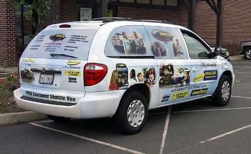
Before I get into this, think about what you remember when you are purposefully investigating the landscape to see what other people are doing. Drive along the highway where the volume numbers get generated. Drive past a rolling wrap and see what you remember from the drive by, 5 seconds after you passed it. Odds are you may response with, “well…it was blue…and there was a website on it…and I remember that the driver should have got out of the left lane, because he was obstructing ME!.This example illustrates a lot of what NOT to do. Try to imagine seeing this in real life and if you would even bother trying to decipher what they are trying to tell you.
Now, let’s consider how to make that a high value, outdoor advertising mechanism that is actually effective. A vehicle graphic is more effective if it accomplishes 3 three things.
- Eye candy that attracts attention
- Any immediate (and I mean IMMEDIATE) understanding of why the viewer should care. Think about what your target needs to know.
- An easy way to understand how to get more info
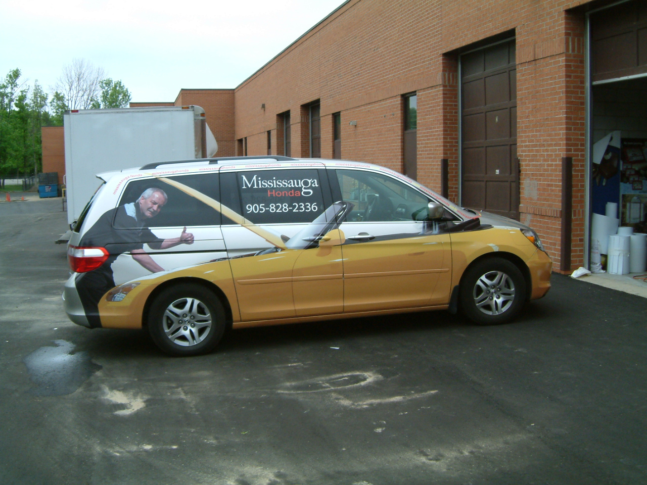
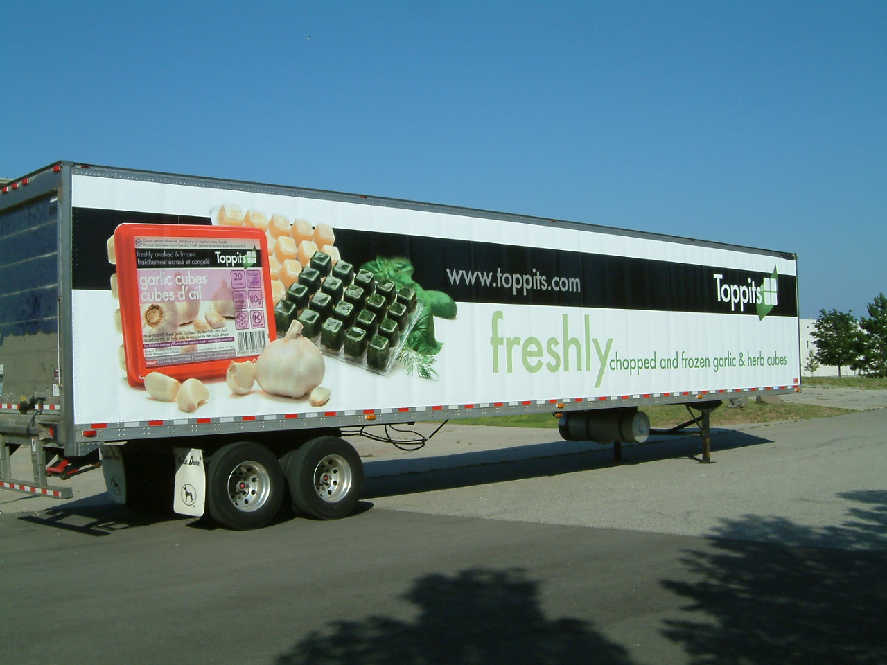
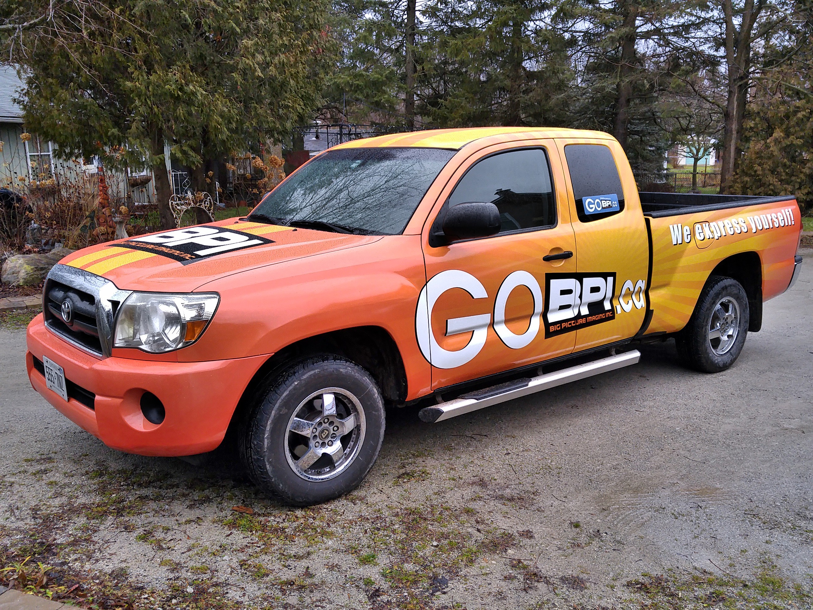
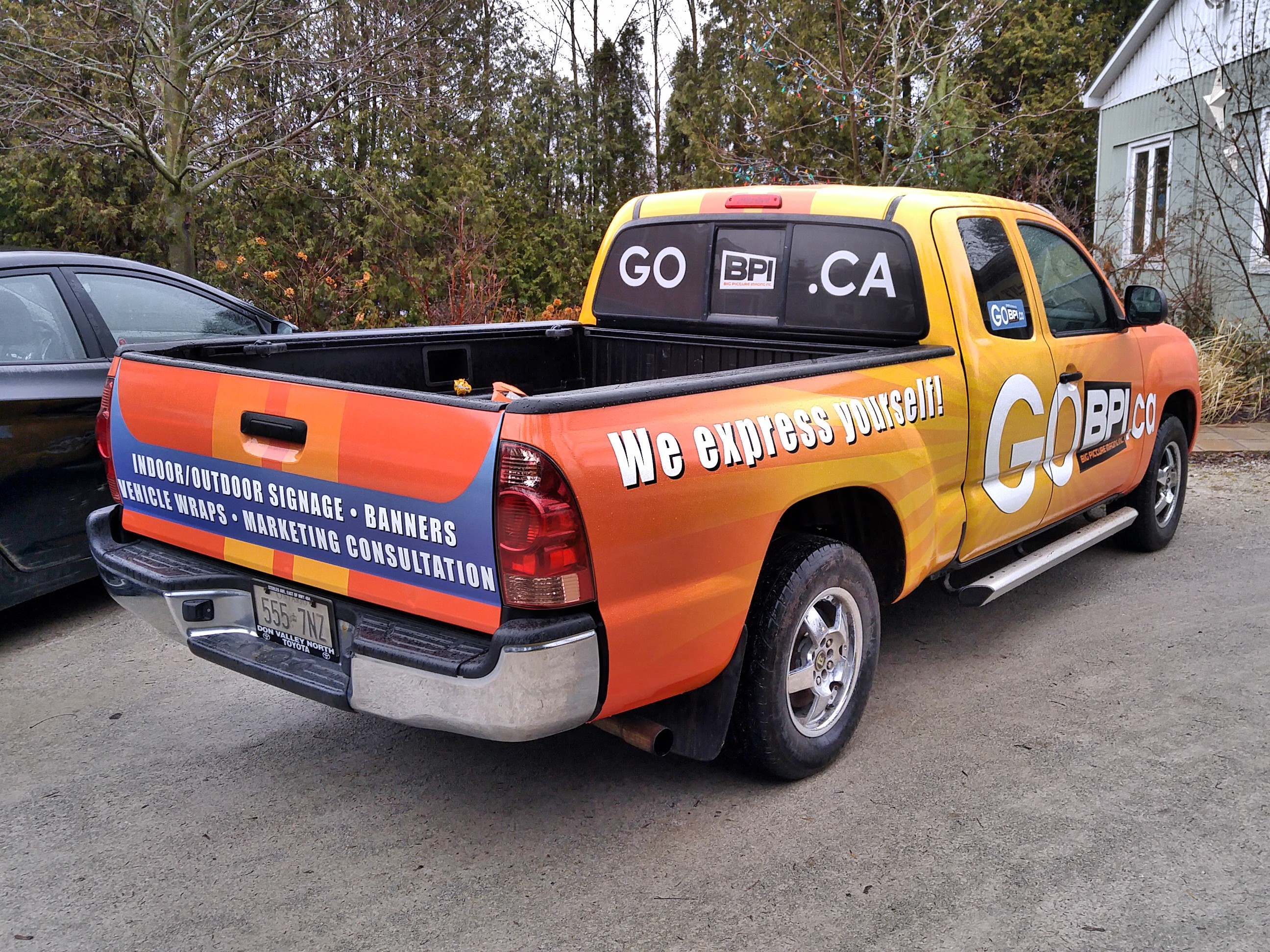
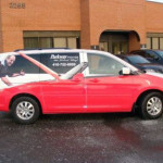
Eye candy is easy. We see white trucks, black and grey cars which seem to be the dominate the highways and bi-ways. A red, orange or yellow car stands out. There are a lot of colours, Some very standard that are unusual enough in today’s environment, that you will have many alternatives to pick from. Keep the colour background to a simple single colour, without complicating with a rainbow of colours because that is what will be remembered, not the benefit you want to express. A single bright (and clean) colour will accomplish step one “Look at me!!
You have now earned the right to tell them something. But be lightning quick. The more letters you apply to your vehicle, the more likely the response of a viewer will be “Forget it. I’m never going to get all that, so I’m not going to start reading”. Think about how you filter out distractions as you are driving around. Letters mean a commercial truck. You have the radio on. Your are trying to halfway de-stress on your drive home from work. Last thing you want is some electrician telling you who he is when you have no need for one at the moment. The thing is, you may need an electrician in the future and if they gave you a reason to remember them, you could file it away for future reference. Same goes for all the trades. Any images that are a bigger detail of something that is usually small can make a huge impression, literally. If you saw a van driving by with a 4′ tall wall receptacle, what would you think? That guys an electrician. You don’t have to read it. You know it. Time lapse to having your attention and knowing what this vehicle is about is a second. You know have 2 seconds of a viewers attention left now to combine why they should care, with how to get more information.
You’re thinking, “oh yeah genius; website right?” Yes, website, but how you display your website can be a double whammy with one way more effective than another and one way being pretty close to useless. One way is illustrated below as a call to action, but there are ways to make that call based on the benefit you deliver. Don’t underestimate the value of a tag line. That tag line needs to do two things. Clearly identify what you do and clearly express why you are a good choice
Got questions?
Thanks for reading!
Brian
Leave a Reply