Its a beautiful thing when a plan comes together. We began as a company that thought we would take a shot at being a printer that would support the vehicle graphics industry.
Change or die.
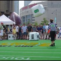
One of the things we discovered we were good at, was responding to requests for things that we had never done. We supported special events companies with projects like making a portable football field and giant dice to support a consumer product event.
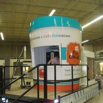
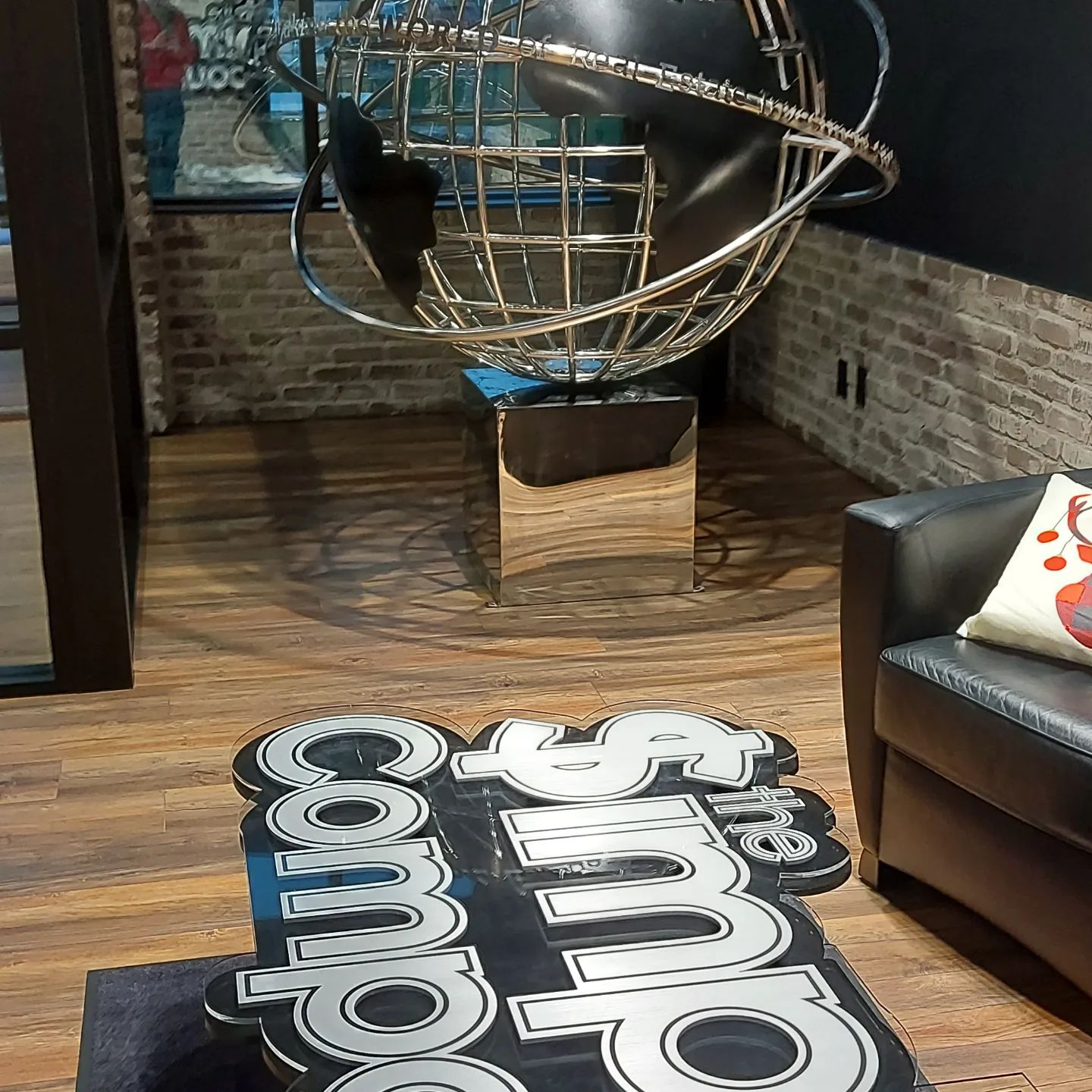
A 9′ tall coffee cup mounted to trailer with its own energy source and water resevoir to support a coffee sampling promotion at the Whistler Winter Olympics and then came this.
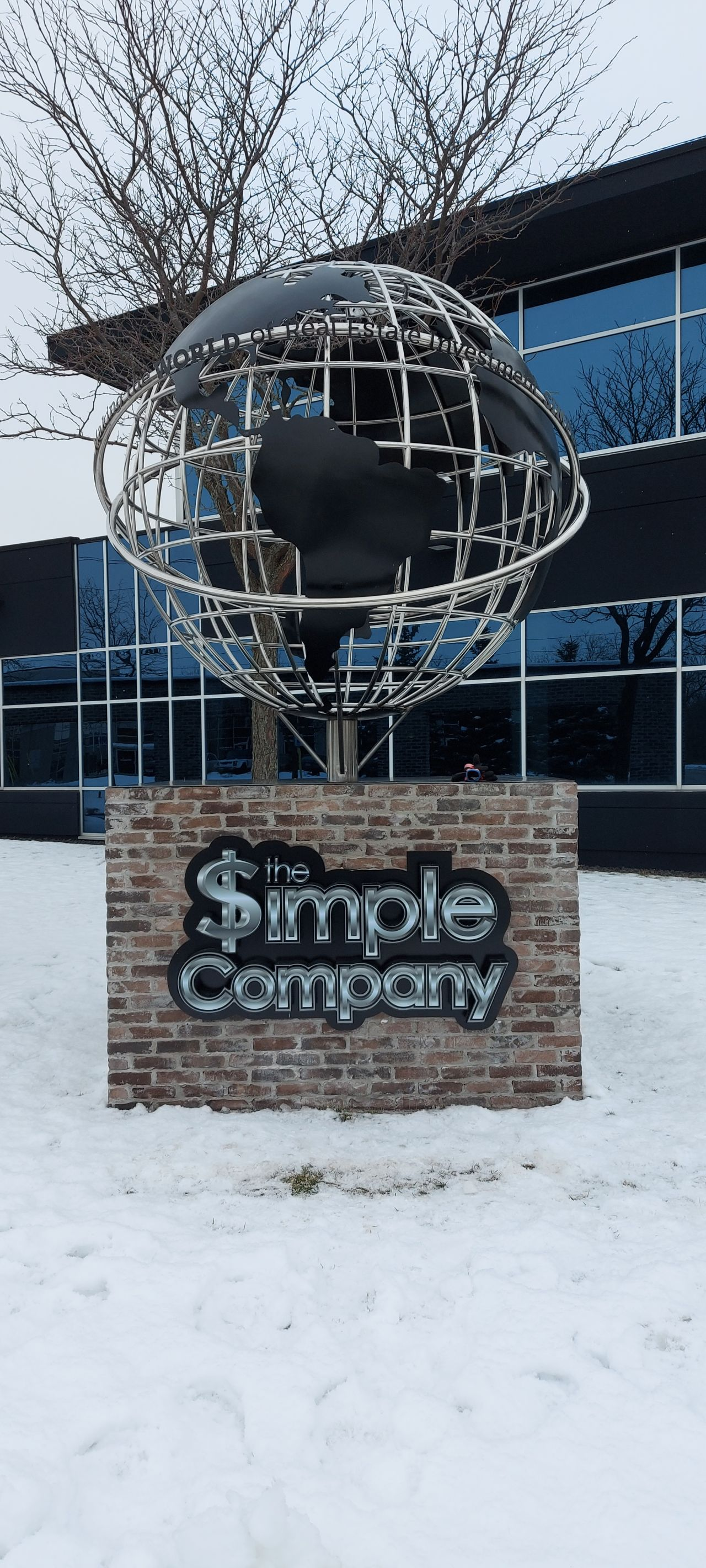
Client specified a BIG stainless steel globe and accompanying signage,
as well as a smaller spinning version for the lobby.
Never stop learning and (almost) never say, “No, we don’t do that”
Are you a small business owner without a marketing department, or maybe a recent marketing graduate with very little real world experience? Then this might be for you.
Let’s start with the question; What is directional signage. Quite simply, signage that informs: “which way do I go?”
If you want a dynamic environment in any situation; you need to put thought into it. As it relates to retail communication issues, it can also relate to directional signage.
Some directional signage is strictly practical. Washroom this way. Exit that way. However, when you are trying to suggest to a potential customer that they are being invited to go in a particular direction, where they will be rewarded with knowing something valuable; it takes a little more thought.
One of the most important phases as we get to know our customers needs is to thoroughly understand what their business is all about. We want to know, from the perspective of the consumer, why anyone should care. Once we get it as consumers, we can more effectively assist in conveying what ultimately is established as the strategic communication objective.
A lot of people mix up strategy and tactics, but they are significantly different, as tactics serve to support the strategy. At Big Picture Imaging, although we started in the business thinking that it was a good name for a company that prints big stuff; it really has become the foundation of how we think about the bigger picture of our customers. Establishing strategy is critical and it makes it very handy to measure against, as you determine tactics to support it.
I’m going to illustrate this through a specific company we are currently working with.
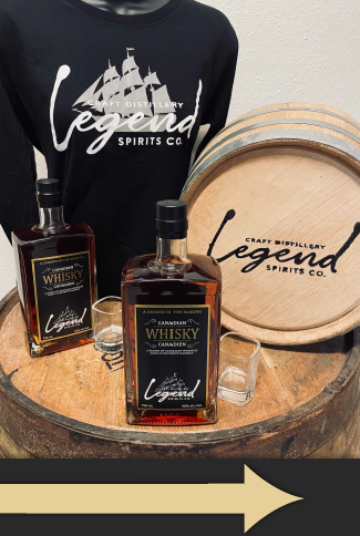
Legend Spirits is a new company establishing itself as a craft distillery in a tourist oriented, smaller city in Ontario. It became evident, from initial meetings with ownership, that they were passionate about creating unique and interesting flavours with an old-world craftsmanship approach to experimentation and delivery of premium quality products. One might think that a bottle of booze is a bottle of booze, but in this day and age, creating an image, and backing it up with quality is the real deal, especially for small businesses competing with significantly bigger guns with monstrous advertising budgets.
Every tactical execution must support the strategic communication objective (We create high value premium products that are both interesting and, in some cases, unique).
Now, after that circuitous rout to get here, we’ll get back to the issue at hand; directional signage.
Directional signage is a viewable mechanism that can be used to communicate the messages that will support the strategy. How you “say” something can be equally important to “what” you are saying. Colours matter. Copy matters. Images matter and even a lack of images can matter.
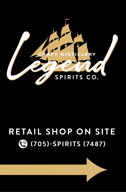
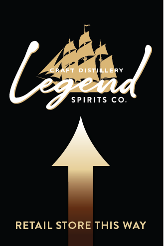
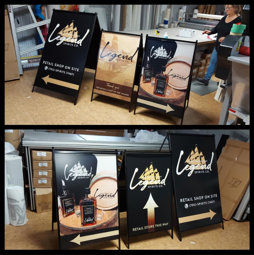
These a-frames are used outside of their new facility, to direct potential customers into the retail store Visually, they are designed to reinforce a look of quality, some old-world craftsmanship, a teaser of what will be found inside, but overall, a consistency of a brandmark that can stick around mentally when future choices are considered.
Our modern world is full of distractions. I sometimes refer to it as visual pollution. Imagine yourself at a festival, or a craft marketplace. What do you see? Probably a lot of very colourful displays vying for your attention. Eye candy everywhere and your brain wrestling with where to look, how much time to process and finally deciding if you want to investigate further. Good odds that your brain will not process fast enough to tell feet to walk over…unless that message was powerful enough, or timely enough, to influence your effort in response.
Keeping that in mind; we opted to suggest a simple black and white device to attract attention in the thunderstorm of colour at outdoor events. Black & white is a classic combination and is virtually timeless. It never goes out of style. This canopy display for use at various events will not overshadow the product, which will be merchandised within this peaceful environment. This company is purposefully providing a relaxing visual, much like the wares it sells are designed to deliver the same reward.
A back wall was also required. It’s tempting to use a back wall as a sales tool and place pictures of products, but again, that makes it “noisy” and actually redundant. The products will be merchandised on a table and the objective of event marketing, especially in this case, is to initiate a more personal relationship with potential clients. The PEOPLE in the booth are there for that purpose. Why confuse the issue with something else trying to grasp/distract attention for the objective at hand.
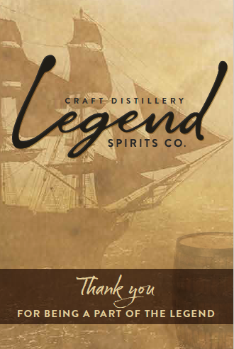
And finally, a tag line has been established. Simply displayed and immediately activates the brain of the reader to take an idea away.
We’re confident that the ownership attitudes and attention to detail will pay dividends in the future. If you’re ever in Parry Sound, Ontario; look them up.
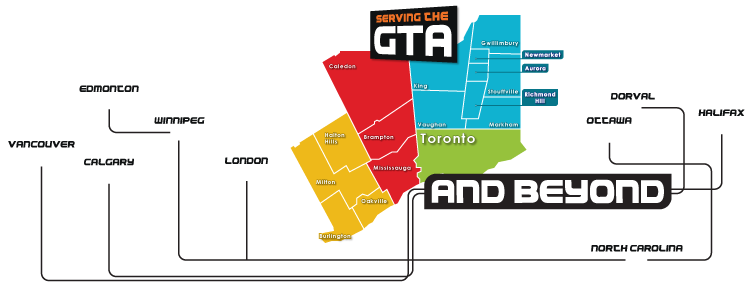
Need some help on your awareness projects. We serve the Greater Toronto Area and have supported car dealerships across the country. Gobpi.ca
A favourite client introduced me to this axiom. This was her response to my question, “Why do you use us as a resource when you know you could find cheaper alternatives?”
We have never been the cheapest game in town on vehicle graphics and we don’t based our prices on what our competition charges. We price our services based on what it is worth to put our focus, our experience and our effort to deliver a premium result in the hands of our clients.
Case in point; we received a call from a potential client that wants us to fix a “botched” job on a vehicle wrap. This is not the first time this has happened to us. A client asks us to quote. We lose the bid because a competitor comes in cheaper and then they come back and want it redone properly. Our quote doesn’t change, but we have to add on a fee to remove the inadequate previous job. That is when cheap gets expensive.
It means something else too when you are driving your mobile marketing message. The impression that vehicle makes is exactly the impression that is displayed to suggest your company either cares about quality or it doesn’t. If you don’t care about the impression you make to your customers before they engage your services; how can you expect them to think you care about the impression you have left after the job is done? Are we perfect? Nope. We have made mistakes but our clients can be confident that we will fix it and we will learn to ensure we don’t make the same mistake twice.
Anyone in this business knows what short cuts to take to save cost. How would you know if the inks used are UV resistant? How would you know that you can over-laminate vinyl with a film that will improve the UV resistance by a factor of five? Its not really up to you to know. It’s the responsibility of a value driven vendor to know that for you.
It all sounds like marketing mumbo jumbo, but the reality is that people want to confidently buy services. We all need to make resource decisions and we want to be assured we are making the right choice. We don’t knock on a lot of doors. Our sixteen years in the business brings us referrals based on satisfied clients being our best sales people.
So why am I telling you all this? To try to make you aware that value should be your primary driver; not cheapest price. Not just for vehicle graphics. For any purchase you make.
There it is. Short and sweet. Either that makes sense to you or it won’t.
Got questions? Feel free to contact us if you are in the Greater Toronto Area. Preferably west end. I am not the biggest fan of the 401. Have a great day! www.gobpi.ca
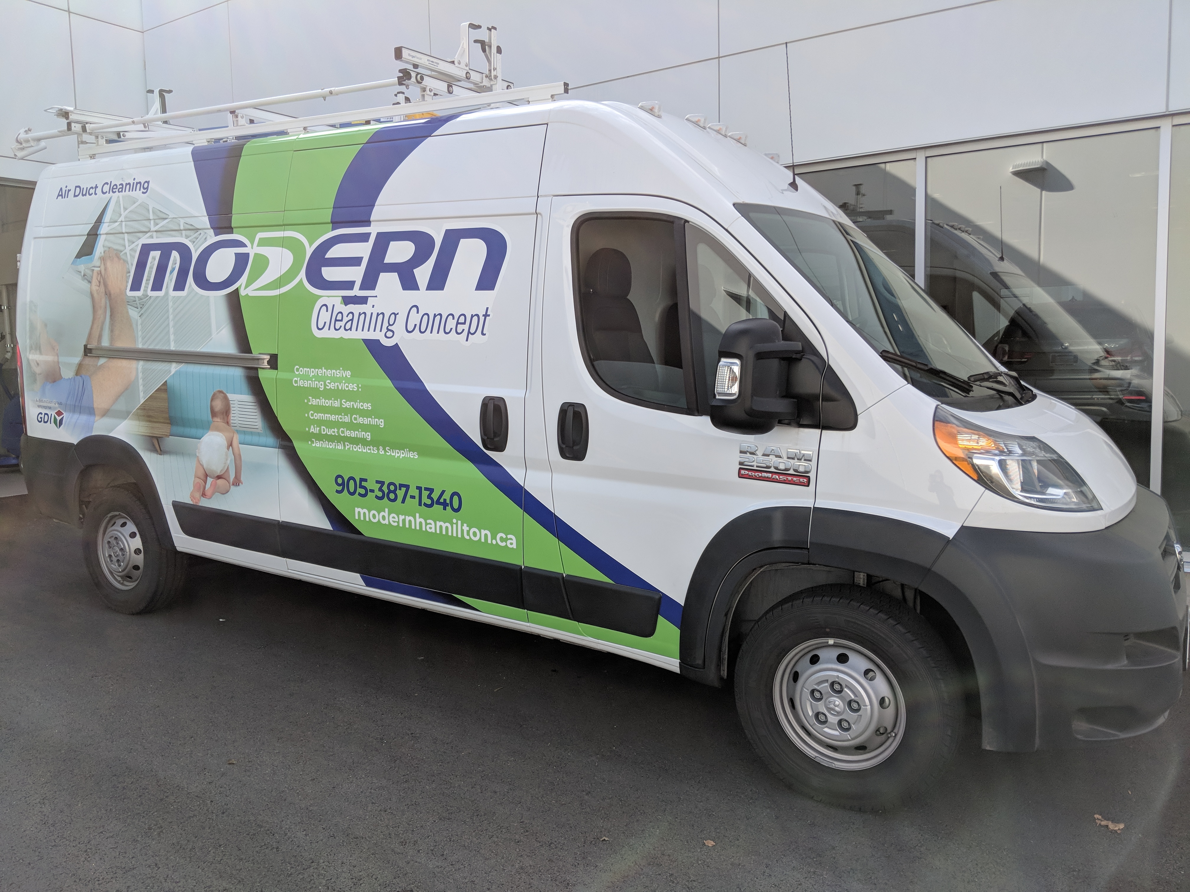
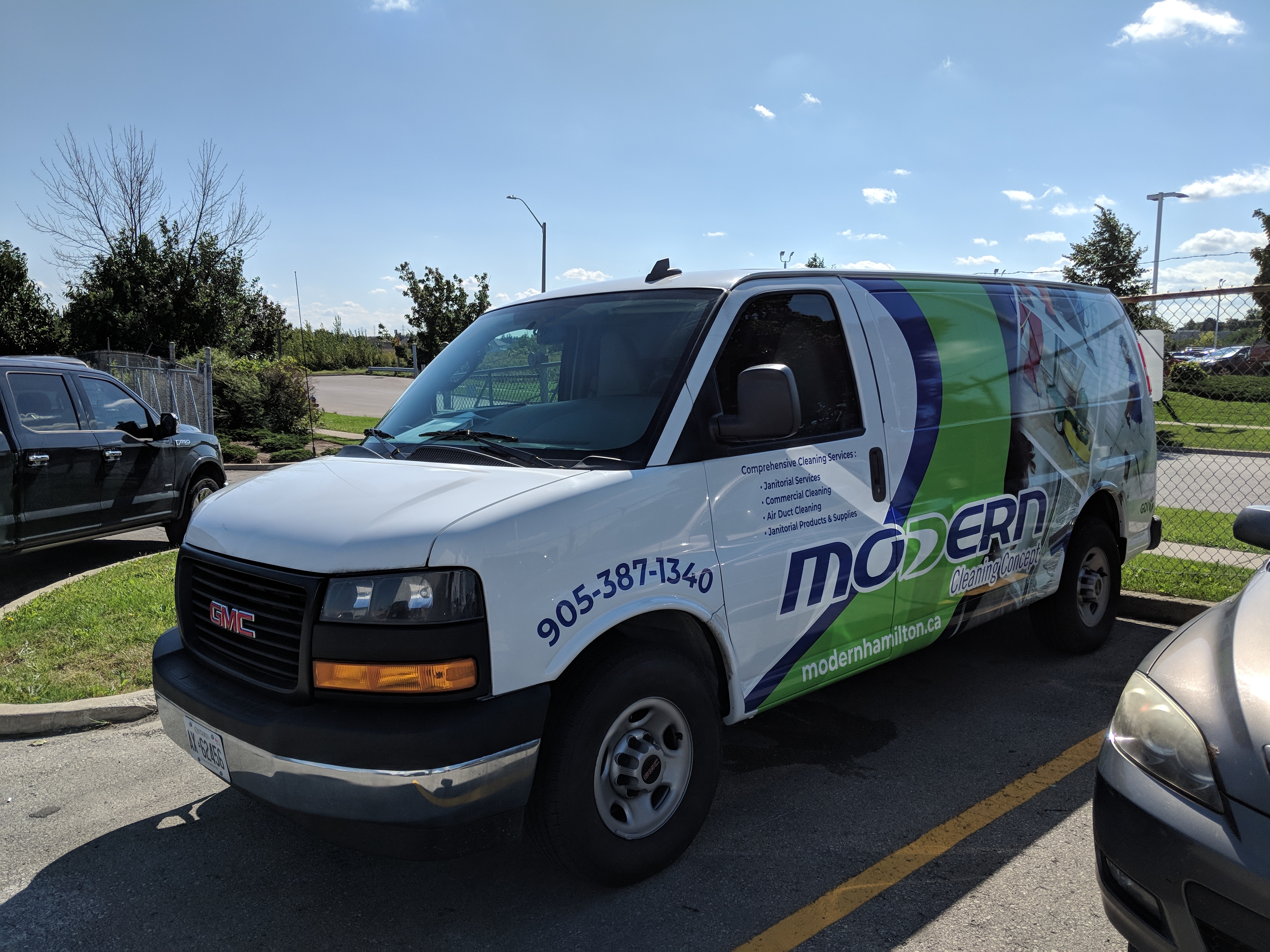
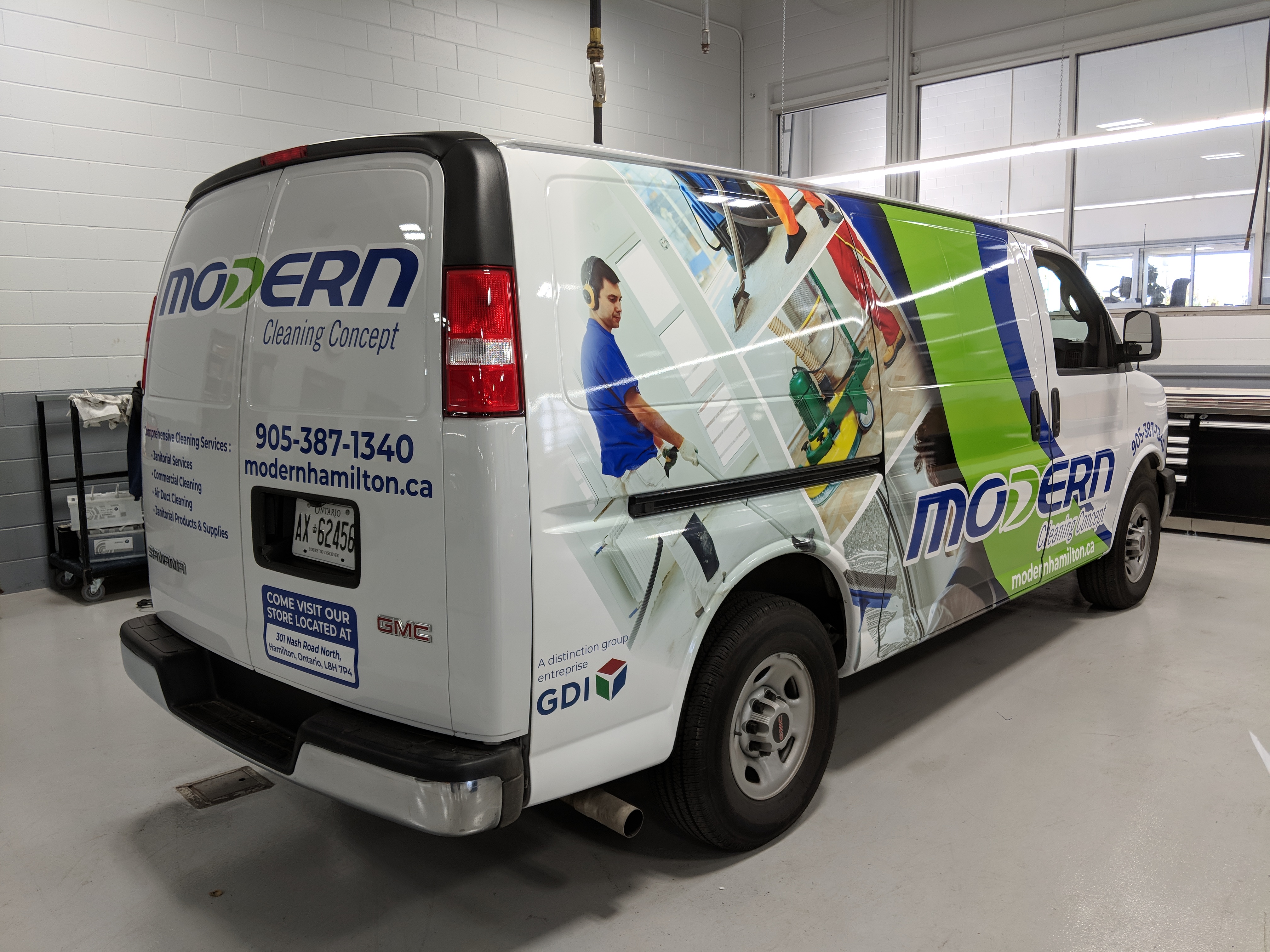
It is very easy to place a logo on a vehicle and then think “Done. We have maintained the integrity of the brand”, but while that is relevant, the trick is to be consistent in the message associated with the brand, versus an icon that is easy to replicate.
Outdoor advertising, of which vehicle graphics is a definite category, demands a bit more complexity. It is communicating a message to hundreds of thousands of road warriors, and if you haven’t built your brand with all the other media mechanisms (TV, radio, magazine, social media) you have to pack your entire punch on your fleet…or your work truck.
Consistency of message is critical when you have a multiple vehicle fleet.
The three areas to carefully consider are initial eye candy to attract attention, then a clear understanding of why the viewer should care and finally an easy way to connect with the potential vendor.
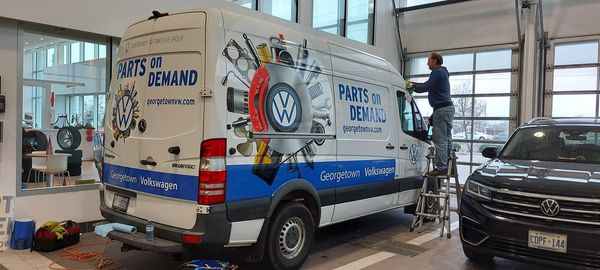
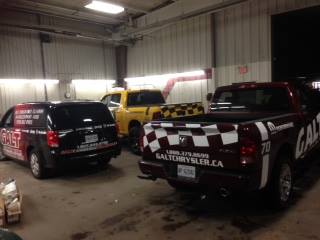
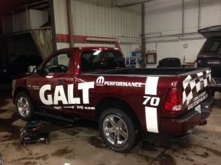
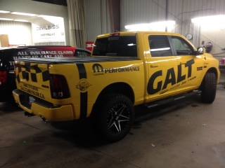
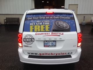
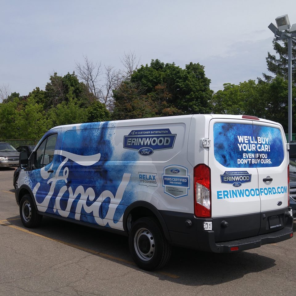
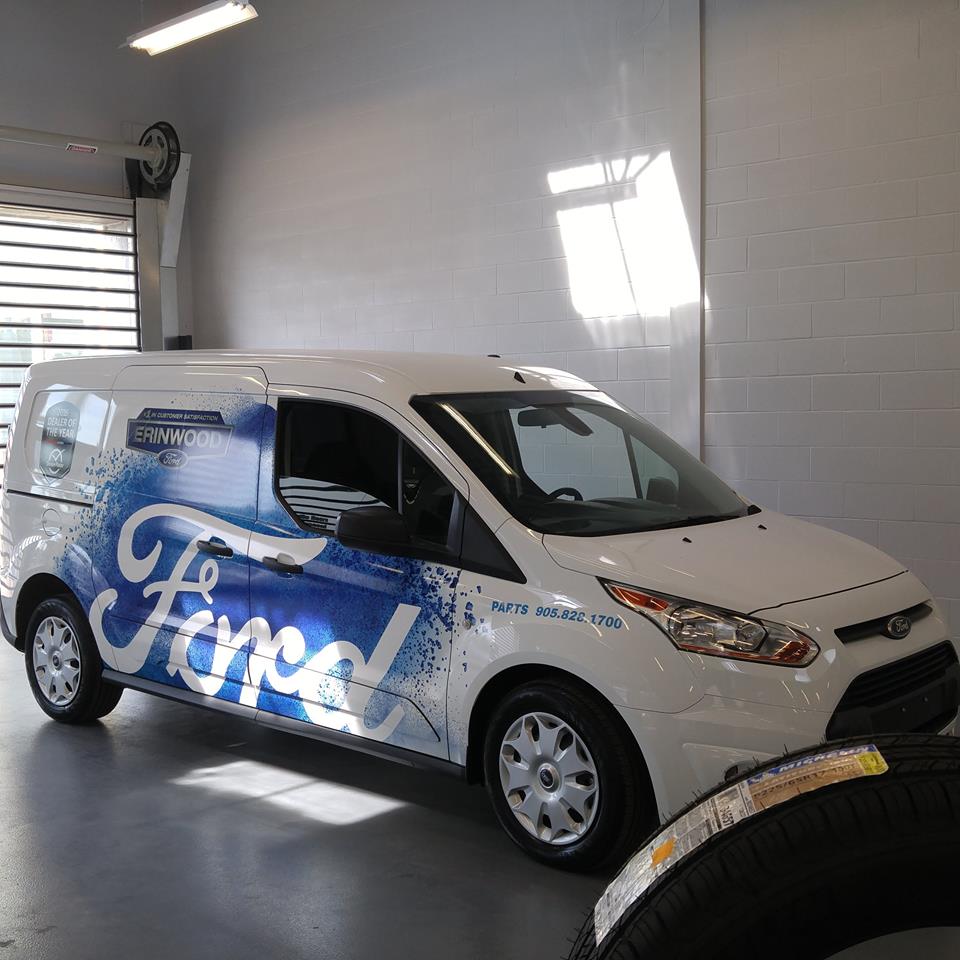
In this case different background colours are irrelevant to the brand. The colours add eye appeal. But the message is simple; there is a Chrysler dealer in Galt. This aimed at consumers and independent mechanics who need parts. This dealer has about 5 trucks in town and every one of them ties the same message as a foundation with overlying messages on the back where a driver has an opportunity to give the message some attention.
This dealership does a great job of consistently communicating that they are there for all the potential customers they pass each day. The consistent foundation, coupled with a few variety communication elements tells the people who see multiple versions, that they offer a range of services, including those they may not see referenced. All they know is what they have seen and each time they see a new one, they have a built-in expectation that they may see another. OK, let’s call that psychological babble, but our brains have some interesting habits that consistently get represented by us all. This dealership has enough trucks on the road in a relatively smaller population town where the odds of seeing this advertising mechanism is high.
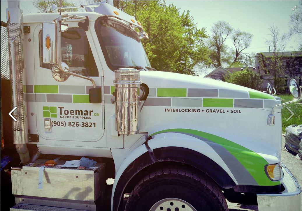
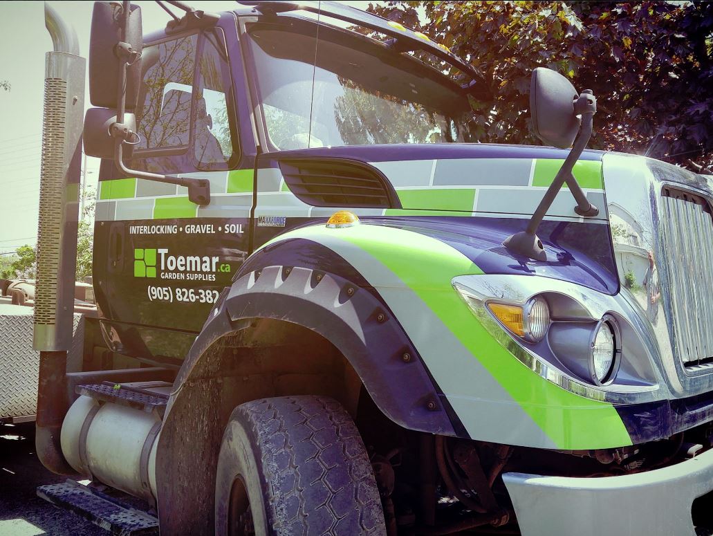
Here are some other examples of the three key issues necessary to consistently manage your message. A powerful corporate brand, the dealership “personal” brand and a consistent mesage on the back of each vehicle offering the same reason to care.
and from a different industry
In conclusion, it really isn’t about a logo. It’s about what the brand actually means. Depending on your marketing budget, how you establish that meaning needs to be considered carefully to ensure people think what you want them to think every time they see a marketing piece used to communicate to them. We call that determining the strategic communication objective. Once that important consideration is established, determining the tactical executions is far more effective.
We help you express yourself. This link takes you to our website section on vehicle graphics Mobile Marketing